![branded_update_bb_logo_r_230728-2.png]](https://knowledge.benefitbay.com/hs-fs/hubfs/branded_update_bb_logo_r_230728-2.png?width=317&height=95&name=branded_update_bb_logo_r_230728-2.png)
In This Article
- Reading the comparison view and its summary counts
- Using the Preferences filter to change tier or shift employee contribution
- Reading the Classes view, including Model Subsidy and PEPM fees
- Current. Present spend, split between employer and employee.
- Renewal. Renewal spend, where a renewal has been loaded. It reads $0 when none has.
- Model. Modeled spend, split between employer, employee, and PEPM.
The Comparison View
This is the default view when a model is opened.
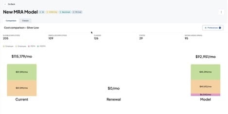
Comparison view, Silver Low.
The model flags sit next to the model name and hover the same way they do everywhere else. For what each flag means, see the article on model flags and preferences.
The Summary Row
Five counts describe the group the model is being run against.

Summary Row: eligible employees, enrolled employees, classes, states, and rating areas.
|
Count |
What it tells you |
|
Eligible Employees |
Everyone eligible for coverage under the model |
|
Enrolled Employees |
How many of those eligible employees are actually enrolled |
|
Classes |
Number of contribution classes in the model |
|
States |
How many states the population spans |
|
Rating Areas (MRAs) |
How many medical rating areas the population spans |
The gap between eligible and enrolled is the number worth pausing on. A model priced across eligible headcount will read very differently from actual spend when participation is low, and that difference is usually the first question an employer asks.
The class, state, and rating area counts tell you how complex the group is. A group spanning 29 states and 95 rating areas will not behave like a single-state group, and it is worth setting that expectation early.
The Cost Graph
The graph is noticeably larger than the previous version, and each amount is printed directly on the bar. Nothing has to be hovered to be read, which makes the page usable on a live screen share.
The legend above the graph identifies the segments: Employer, Employee, PEPM, and PEEPM. The heading over the graph always names the tier being displayed, for example "Cost comparison - Silver Low."
|
Important Check the tier in the heading before quoting any figure from this page. The same model produces materially different numbers at different tiers, and the heading is the only thing on screen that tells you which one you are looking at. |
The Preferences filter
Preferences sits on the right side of the header, on both the Comparison and Classes tabs. It holds three controls, and they work together: the classes filter sets the scope, and the other two act on whatever that scope is.
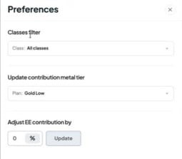
Classes Filter
Defaults to All classes. Narrow it to a single class to see cost information for just that class. This is how you answer a question about one group of employees without rebuilding anything.
Update Contribution Metal Tier
Changes the benchmark tier the model is priced against, and applies across all classes. The heading, the graph, and the Classes tab all update together.
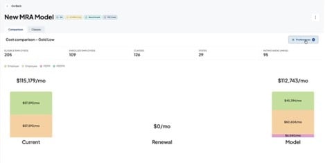
The same model after switching from Silver Low to Gold Low. Modeled cost moves from $92,951 to $112,743 per month while current spend stays fixed.
Running a group through two or three tiers is the quickest way to frame a conversation about where an employer wants to land.
Adjust EE Contribution By %
This is a relative adjustment, not an absolute one. The percentage you enter shifts the employee contribution already in place rather than replacing it.
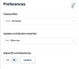
Worked example. Suppose the current employee contribution is 20 percent toward the Gold Low plan. Entering -5 lowers the employee contribution to 15 percent and raises the employer share to 85 percent.
Negative values lower what employees pay and increase employer cost. Positive values do the reverse.
To Apply An Adjustment
- Click Preferences on the Comparison or Classes tab.
- Set the classes filter, either All classes or one specific class.
- Set the contribution metal tier if you are also changing tier.
- Enter the percentage in Adjust EE contribution by, using a negative value to lower the employee share.
- Click Update.
|
Watch Out! The adjustment applies to the current classes filter. If you narrowed the filter earlier and forgot, the change reaches only that subset. Reset the filter to All classes when you intend a model-wide change. |
The Classes View
The second tab at the top left switches from the comparison to the Classes view, which works the same way it did before. One row per contribution class, with the spouse and child contribution shown beneath each class name.
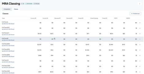
|
Column |
What it shows |
|
Current ER / Current EE |
Present employer and employee spend for the class |
|
Renewal ER / Renewal EE |
Renewal employer and employee spend, where a renewal has been loaded |
|
Model Subsidy |
The subsidy contribution, shown where the contribution is unaffordable and Subsidy Advantage is off |
|
Model ER / Model EE |
Modeled employer and employee amounts |
|
PEPM / PEEPM |
Per employee per month and per enrolled employee per month fees for the class |
Reading across a single row gives you the full story for that class: what the employer and employee pay today, what renewal would cost, what subsidy is available, what the model proposes, and what fees apply. That is usually enough to answer a question about one population without leaving the page.
The arrow at the end of each row drills into the employee-level detail for that class.
Monthly Totals and PEPM minimums
A Monthly Totals row sits at the bottom of the table. Where a PEPM minimum was applied to reach that total, the figure carries an asterisk and a footnote appears below the table.
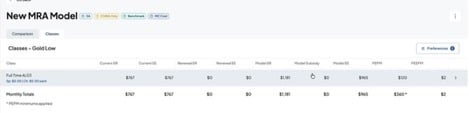
An asterisked total reflects a minimum rather than a straight per-employee calculation. On small classes this matters, because the fee will not scale down the way headcount suggests it should.
Common Questions
I entered 15 in Adjust EE contribution by and the result was not 15 percent.
The field is relative. Entering 15 adds 15 percentage points to the contribution already in place. To move an employee share from 20 percent down to 15 percent, enter -5.
Why does the Renewal column read $0?
No renewal has been loaded for the group. Current and Model still calculate normally.
Model Subsidy is empty across every class.
Model Subsidy populates where a contribution is unaffordable and Subsidy Advantage is off. If Subsidy Advantage is on, subsidy is already factored into the modeled cost instead of being shown separately. Check the SA flag at the top of the model.
The Classes view shows classes with no employees in them.
That is expected. Classes are sometimes created for every state with a rating area combination, and some will have no one assigned. They can be ignored when reading totals.
Which tier am I looking at?
The heading above the graph and above the class table names it. If the two views disagree, refresh the page, since the tier you select in Preferences applies to both.